Brand identity · Metro Detroit
Abe’s Drug Store
An independent pharmacy, rebranded away from clinical convention and rolled out across all five of its metro Detroit locations.
- Client
- Abe's Drug Store
- Location
- Clinton Township, Eastpointe, Roseville, Southfield, Warren
- Year
- 2026
- What we did
- Rebrand / Logo / Brand Guidelines / Print / Window Vinyl / Merch / Billboards / Marketing / Photography / Grand Opening Coordination
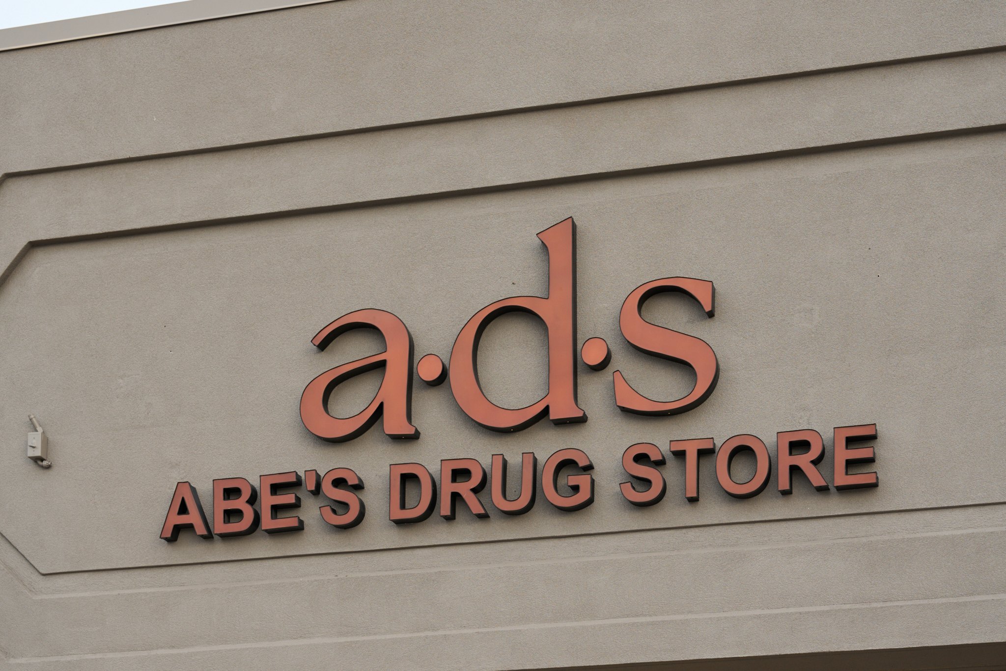
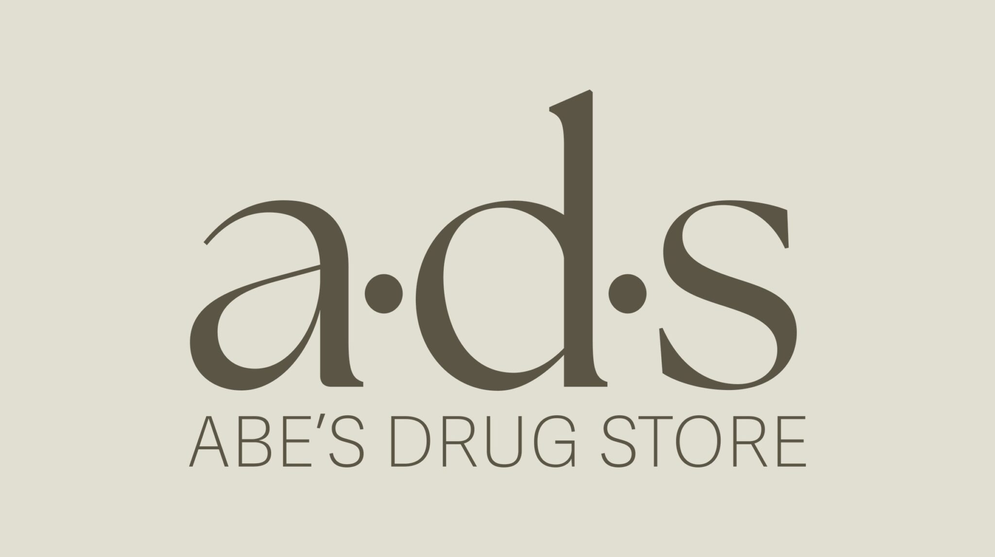
Abe's Drug Store, distilled to a·d·s.
The full name became three lowercase letters set in The Seasons, with the dots raised to the midline so each letter stands apart.
01 / The ask
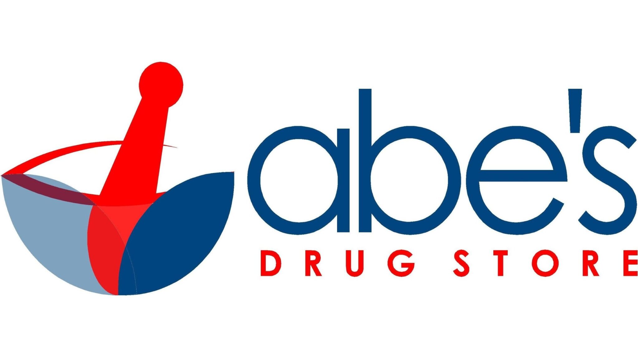
Independent pharmacies tend to borrow the look of the chains: primary red and blue, a mortar and pestle, type that feels lifted from a prescription label. Abe's checked every box. The owners wanted the opposite signal, something holistic and earthy that makes walking in feel closer to visiting a well-kept neighborhood shop. The new identity also had to hold together across five stores in Clinton Township, Eastpointe, Roseville, Southfield and Warren.
02 / Before and after
The shift
We traded stock pharmacy cues for a serif wordmark and a palette drawn from natural materials: cinnamon, olive, sand and vanilla. Black and white were pulled out of the system almost entirely.
03 / The brand
The system
Every location carries its own lockup, and the line Better Care Starts Here travels with the mark wherever space allows. Body copy is set in Adelle Sans Devanagari Thin with tight tracking, which keeps the system light next to the serif. A cut stone texture runs under the mockups and final pieces to echo the materials in the new store builds.
04 / In store
On the shelf
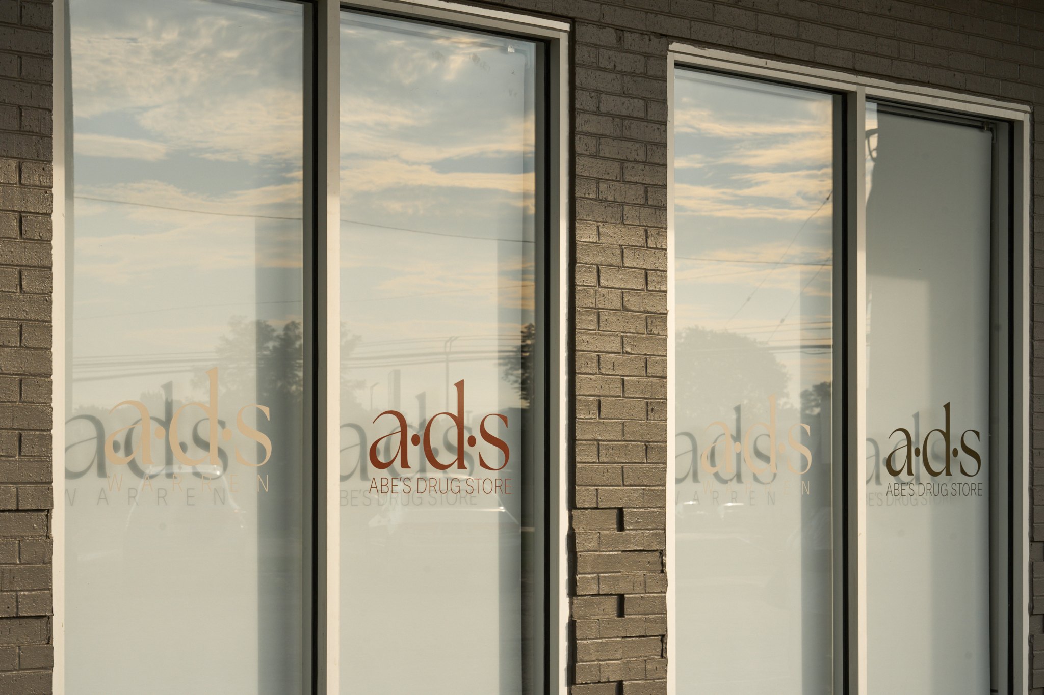
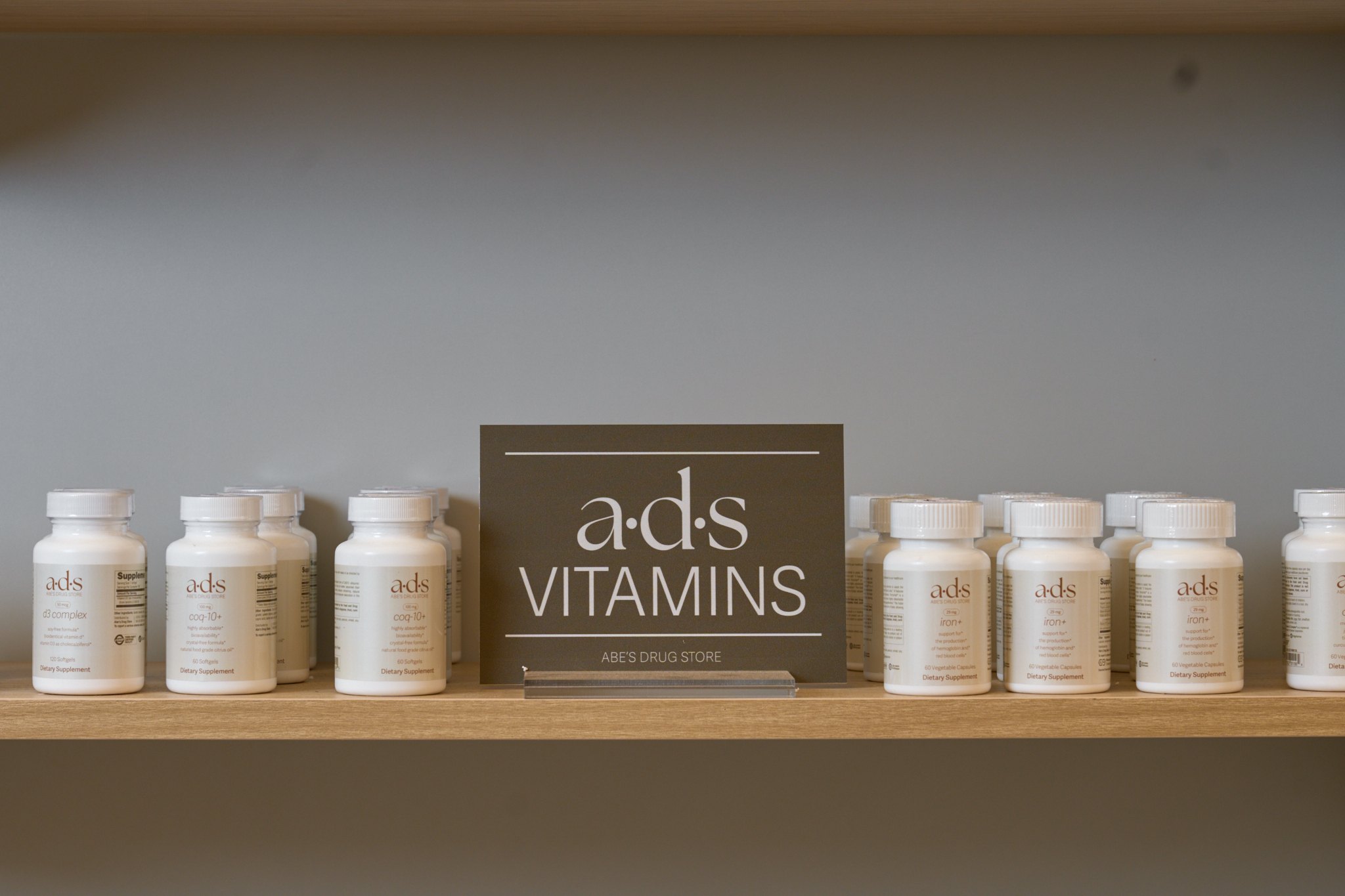
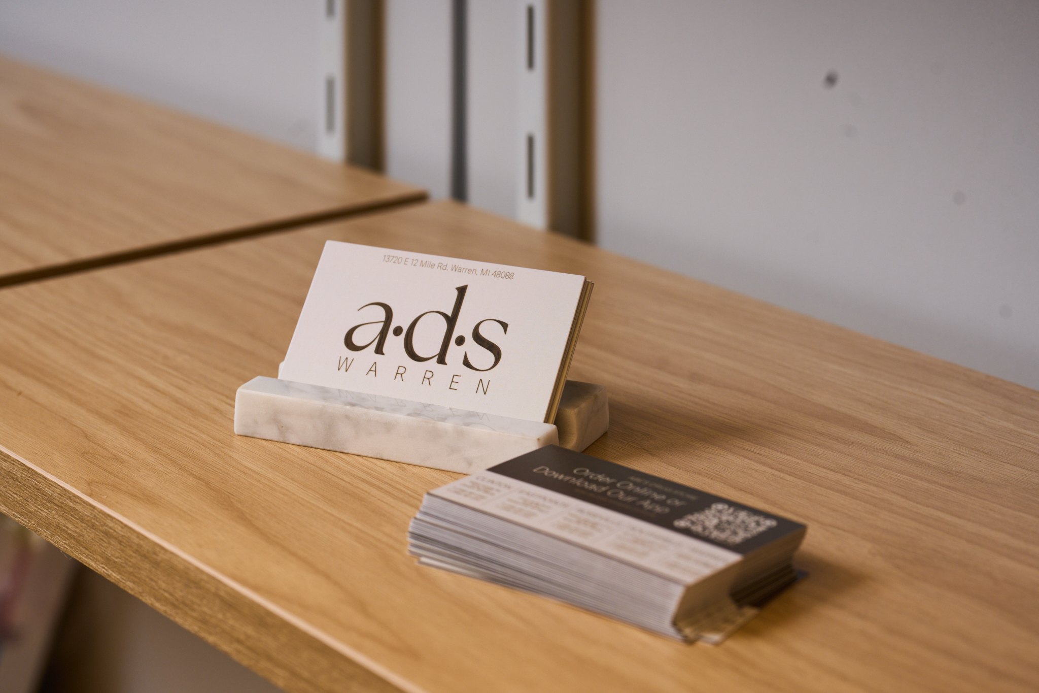
Inside the stores the palette moves onto real surfaces: frosted window vinyl, a private-label vitamin line, olive shelf cards and business cards set on marble.
05 / On the road
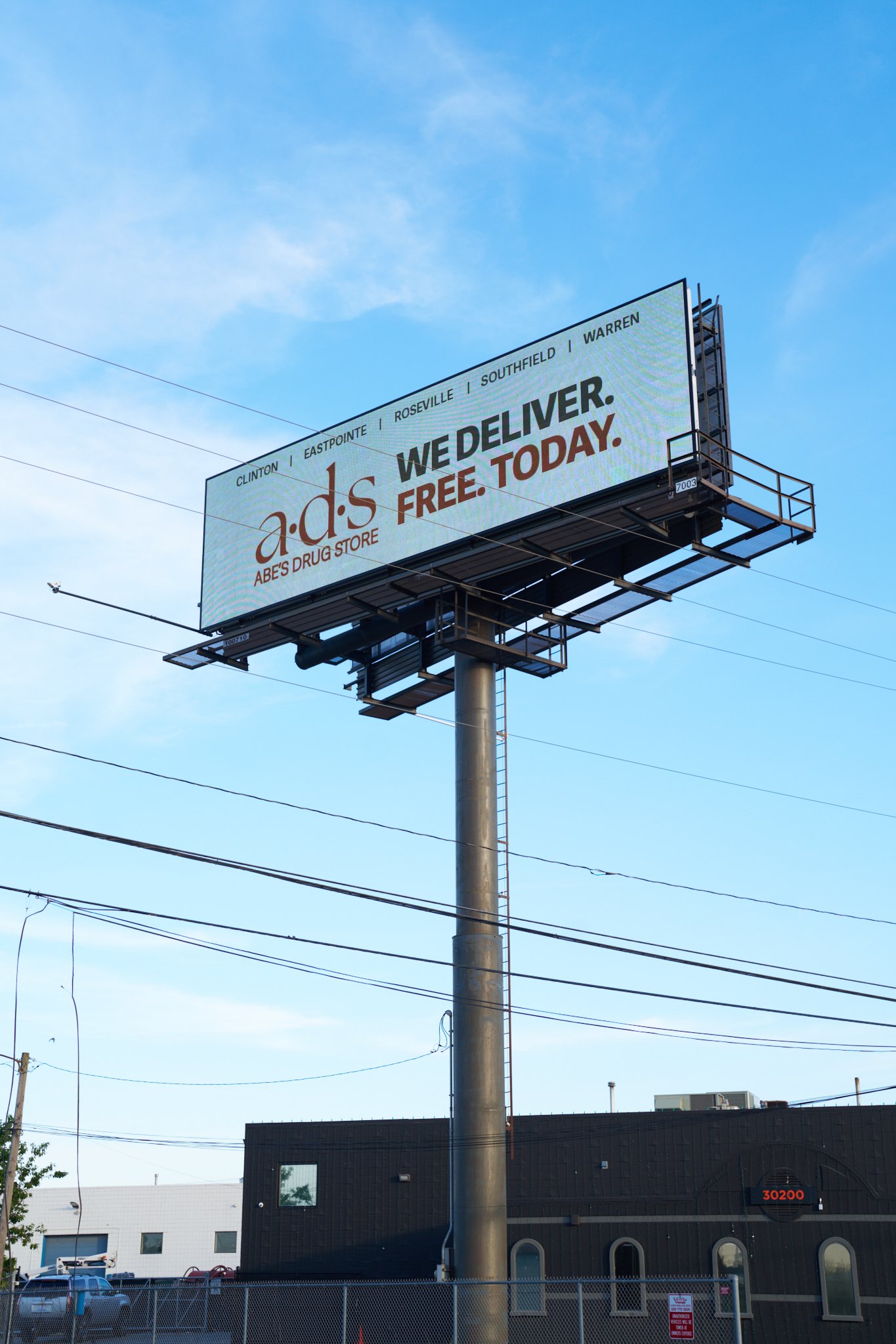
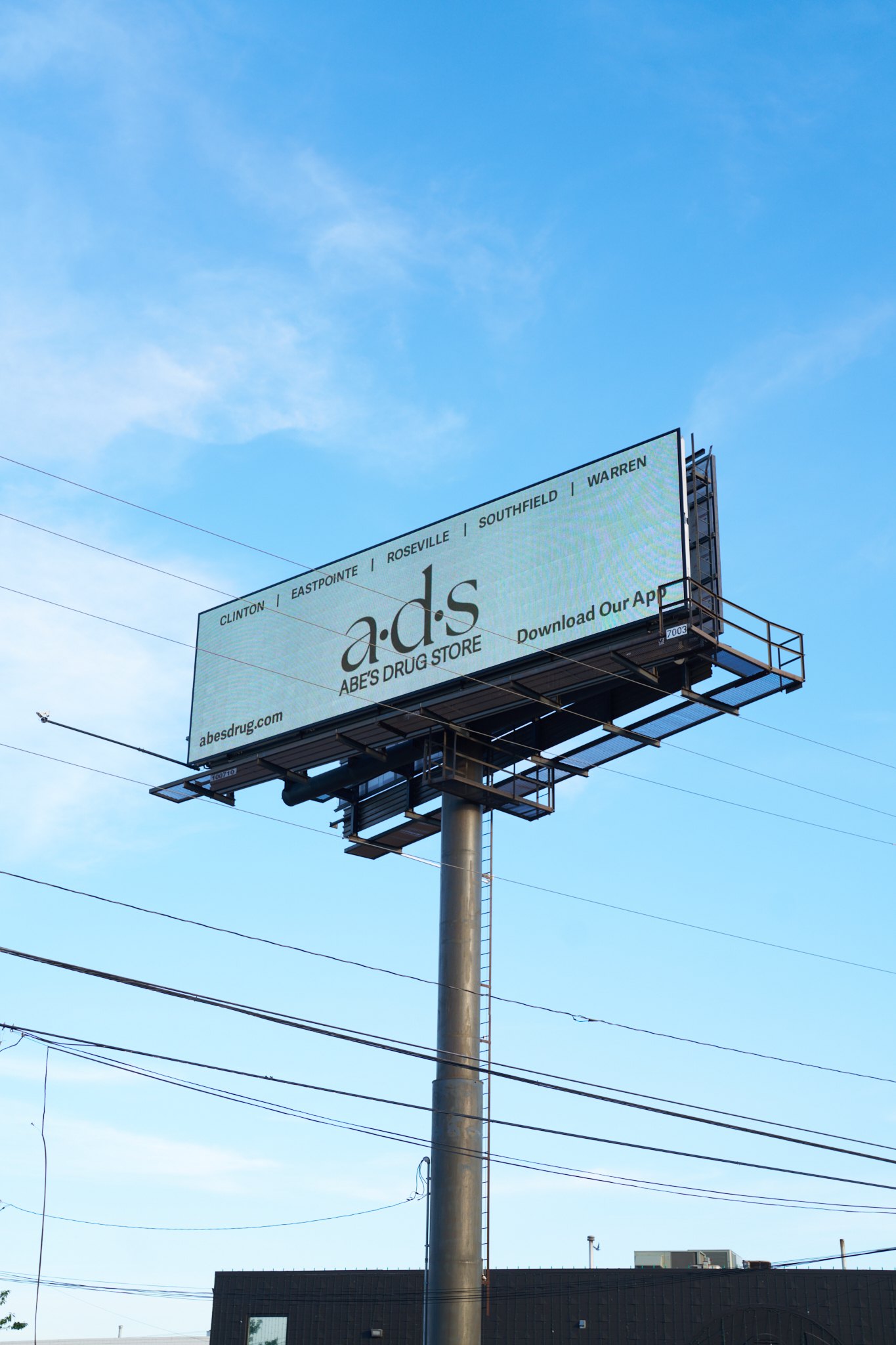
Billboards
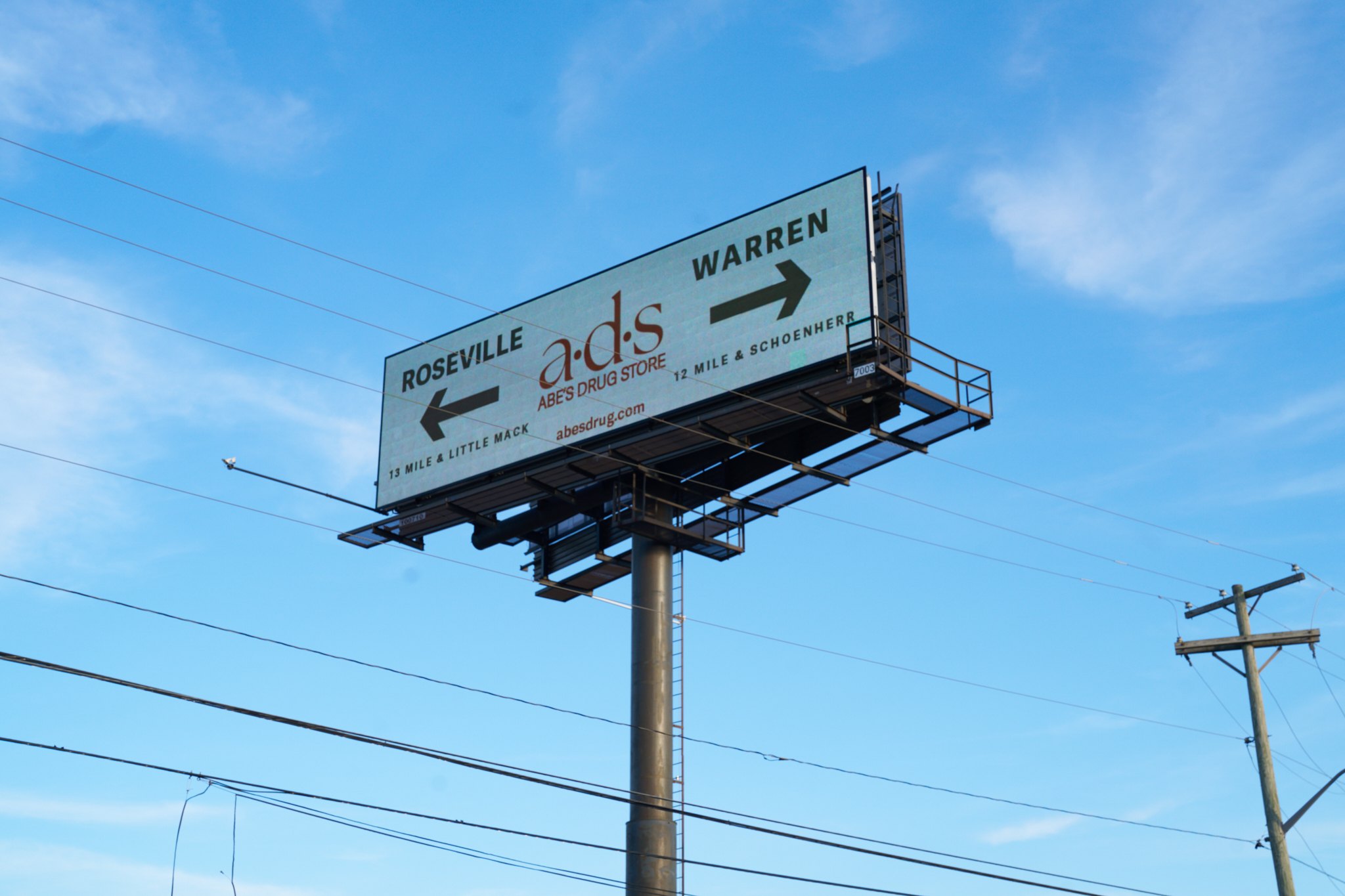
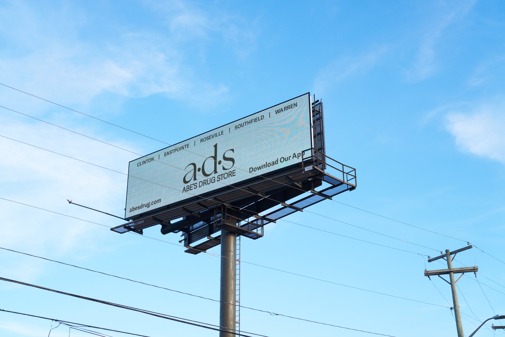
Out on the road the system gets louder but keeps its order: the mark, one message, and the five store names running along the top.
Your turn